ROCnGO is an R package which allows to analyze the performance of a classifier by using receiver operating characteristic () curves. Conventional based analyses just tend to use area under curve () as a metric of global performance, besides this functionality, the package allows deeper analysis options by calculating partial area under curve () when prioritizing local performance is preferred.
Furthermore, ROCnGO implements different transformations described in literature which:
- Make local performance interpretation easier.
- Allow to work with curves which are not completely concave or not at all (improper).
- Provide additional discrimination power when comparing classifiers with identical local performance (equal ).
This document provides an introduction to ROCnGO tools and workflow to study the global and local performance of a classifier.
Data
To explore basic tools in the package we will be using
iris dataset. The dataset contains 5 variables for 150
flowers of 3 different species: setosa, versicolor and
virginica.
For the purpose of simplicity, we will only work with a subset of
iris, considering only setosa and
virginica species. In the following sections, performance of
different variables to classify cases in the different species will be
evaluated.
# Filter cases of versicolor species
iris_subset <- as_tibble(iris) %>% filter(Species != "versicolor")
iris_subset
#> # A tibble: 100 × 5
#>    Sepal.Length Sepal.Width Petal.Length Petal.Width Species
#>           <dbl>       <dbl>        <dbl>       <dbl> <fct>
#>  1          5.1         3.5          1.4         0.2 setosa
#>  2          4.9         3            1.4         0.2 setosa
#>  3          4.7         3.2          1.3         0.2 setosa
#>  4          4.6         3.1          1.5         0.2 setosa
#>  5          5           3.6          1.4         0.2 setosa
#>  6          5.4         3.9          1.7         0.4 setosa
#>  7          4.6         3.4          1.4         0.3 setosa
#>  8          5           3.4          1.5         0.2 setosa
#>  9          4.4         2.9          1.4         0.2 setosa
#> 10          4.9         3.1          1.5         0.1 setosa
#> # ℹ 90 more rows
Global performance
Calculate ROC curve
The foundation of this type of analyses implies to plot the curve of a classifier. This type of curves represent a classifier probability of correctly classify a case with a condition of interest, also known as true positive rate or (), and the complementary probability of correctly classify a case without the condition; also known as false positive rate, , or , ().
When working with a classifier that returns a series of numeric values, it can be complex to say when it is classifying a case as having the condition of interest (positive) or not (negative). To solve this problem, curves represent points considering hypothetical thresholds () where a case is considered as positive if its value is higher than the defined threshold ().
These curve points can be calculated by using
roc_points(). As most functions in the package, it takes a
dataset, a data frame, as its first argument. The second and third
argument refer to variables in the data frame, corresponding the
variable that will be used as a classifier (predictor) and
the response variable we want to predict (response).
For example, we can calculate points for Sepal.Length as a classifier of setosa species.
# Calculate ROC points for Sepal.Lenght
points <- roc_points(
  data = iris_subset,
  predictor = Sepal.Length,
  response = Species
)
points
#> # A tibble: 101 × 2
#>      tpr   fpr
#>  * <dbl> <dbl>
#>  1  1        1
#>  2  0.98     1
#>  3  0.92     1
#>  4  0.92     1
#>  5  0.92     1
#>  6  0.9      1
#>  7  0.82     1
#>  8  0.82     1
#>  9  0.82     1
#> 10  0.82     1
#> # ℹ 91 more rows

# Plot points
plot(points$fpr, points$tpr)
As we may see, Sepal.Length doesn’t perform very well predicting when a flower is from setosa species, in fact it’s the other way around, the lower the Sepal.Length the more probable to be working with a setosa flower. This can be tested if we change the condition of interest to virginica.
Changing condition of interest
By default, condition of interest is automatically set to the first
value in levels(response), so we can change this value by
changing the order of levels in data.
# Check response levels
levels(iris_subset$Species)
#> [1] "setosa"     "versicolor" "virginica"

# Set virginica as first value in levels
iris_subset$Species <- fct_relevel(iris_subset$Species, "virginica")
levels(iris_subset$Species)
#> [1] "virginica"  "setosa"     "versicolor"

# Plot ROC curve
points <- roc_points(
  data = iris_subset,
  predictor = Sepal.Length,
  response = Species
)
plot(points$fpr, points$tpr)
Local performance
Sometimes a certain task may requiere prioritize e.g. high sensitivity over global performance. In these scenarios, it’s preferable to work in specific regions of curve.
We can calculate points in a specific region using
calc_partial_roc_points(). Function uses same arguments as
roc_points() but adding lower_threshold,
upper_threshold and ratio, which delimit
region in which we want to work.
For example, if we require to work in high sensitivity conditions, we could check points in region of .
# Calc partial ROC points
p_points <- calc_partial_roc_points(
  data = iris_subset,
  predictor = Sepal.Length,
  response = Species,
  lower_threshold = 0.9,
  upper_threshold = 1,
  ratio = "tpr"
)
#> ℹ Upper threshold 1 already included in points.
#> • Skipping upper threshold interpolation
p_points
#> # A tibble: 54 × 2
#>      tpr     fpr
#>  * <dbl>   <dbl>
#>  1  0.9  0.00667
#>  2  0.94 0.02
#>  3  0.94 0.02
#>  4  0.94 0.02
#>  5  0.96 0.06
#>  6  0.98 0.06
#>  7  0.98 0.06
#>  8  0.98 0.1
#>  9  0.98 0.1
#> 10  0.98 0.1
#> # ℹ 44 more rows

# Plot partial ROC curve
plot(p_points$fpr, p_points$tpr)
Automating analysis
Performance metrics
When working with a high number of classifiers, it can be difficult
to check each
individually. In these scenarios, metrics such as
and
may present more interest. Thus, by using the function
summarize_predictor() we can obtain an overview of the
performance of a classifier.
For example, we could consider the performance of Sepal.Length over a high sensitivity region, , and high specificity region, .
# Summarize predictor in high sens region
summarize_predictor(
  data = iris_subset,
  predictor = Sepal.Length,
  response = Species,
  threshold = 0.9,
  ratio = "tpr"
)
#> ℹ Upper threshold 1 already included in points.
#> • Skipping upper threshold interpolation
#> # A tibble: 1 × 6
#>     auc   pauc np_auc fp_auc ncp_auc curve_shape
#>   <dbl>  <dbl>  <dbl>  <dbl>   <dbl> <chr>
#> 1 0.985 0.0847  0.847  0.852   0.973 Concave

# Summarize predictor in high spec region
summarize_predictor(
  data = iris_subset,
  predictor = Sepal.Length,
  response = Species,
  threshold = 0.1,
  ratio = "fpr"
)
#> ℹ Lower 0 and upper 0.1 thresholds already included in points
#> • Skipping lower and upper threshold interpolation
#> # A tibble: 1 × 6
#>     auc   pauc sp_auc tp_auc ncp_auc curve_shape
#>   <dbl>  <dbl>  <dbl>  <dbl>   <dbl> <chr>
#> 1 0.985 0.0954  0.976  0.973   0.993 Concave
Besides and , function also returns other partial indexes derived from which provide a better interpretation of performance than .
Furthermore, if we are interested in computing these metrics
simultaneously for several classifiers summarize_dataset()
can be used, which also provides some metrics of analysed
classifiers.
summarize_dataset(
  data = iris_subset,
  response = Species,
  threshold = 0.9,
  ratio = "tpr"
)
#> ℹ Lower 0.9 and upper 1 thresholds already included in points
#> • Skipping lower and upper threshold interpolation
#> $data
#> # A tibble: 4 × 7
#>   identifier     auc   pauc np_auc fp_auc ncp_auc curve_shape
#>   <chr>        <dbl>  <dbl>  <dbl>  <dbl>   <dbl> <chr>
#> 1 Sepal.Length 0.985 0.0847 0.847   0.852   0.973 Concave
#> 2 Sepal.Width  0.166 0.0016 0.0160  0.9     0.177 Hook under chance
#> 3 Petal.Length 1     0.1    1       1       1     Concave
#> 4 Petal.Width  1     0.1    1       1       1     Concave
#>
#> $curve_shape
#> # A tibble: 2 × 2
#>   curve_shape       count
#>   <chr>             <int>
#> 1 Concave               3
#> 2 Hook under chance     1
#>
#> $auc
#> # A tibble: 2 × 3
#> # Groups:   auc > 0.5 [2]
#>   `auc > 0.5` `auc > 0.8` count
#>   <lgl>       <lgl>       <int>
#> 1 FALSE       FALSE           1
#> 2 TRUE        TRUE            3
Plotting
As we have seen, by using the output of roc_points() we
can plot
curve. Nevertheless, these plots can also be generated using
plot_*() and add_*() functions, which provide
further options to customize plot for classifier comparison.
For example, we can plot points of Sepal.Length in this way.
# Plot ROC points of Sepal.Length
sepal_length_plot <- plot_roc_points(
  data = iris_subset,
  predictor = Sepal.Length,
  response = Species
)
sepal_length_plot
#> Ignoring unknown labels:
#> • fill : "Bound"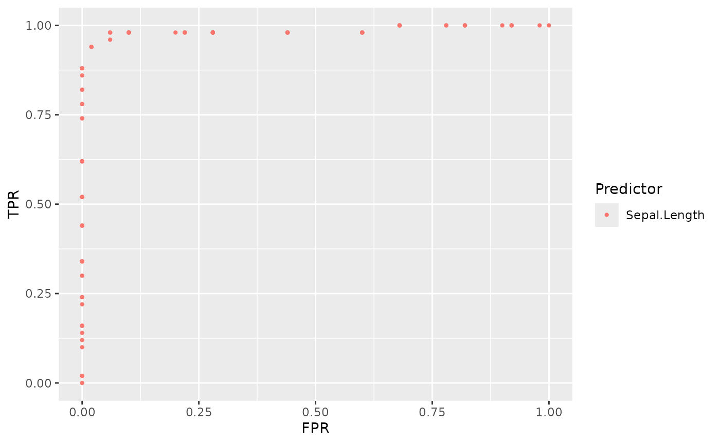
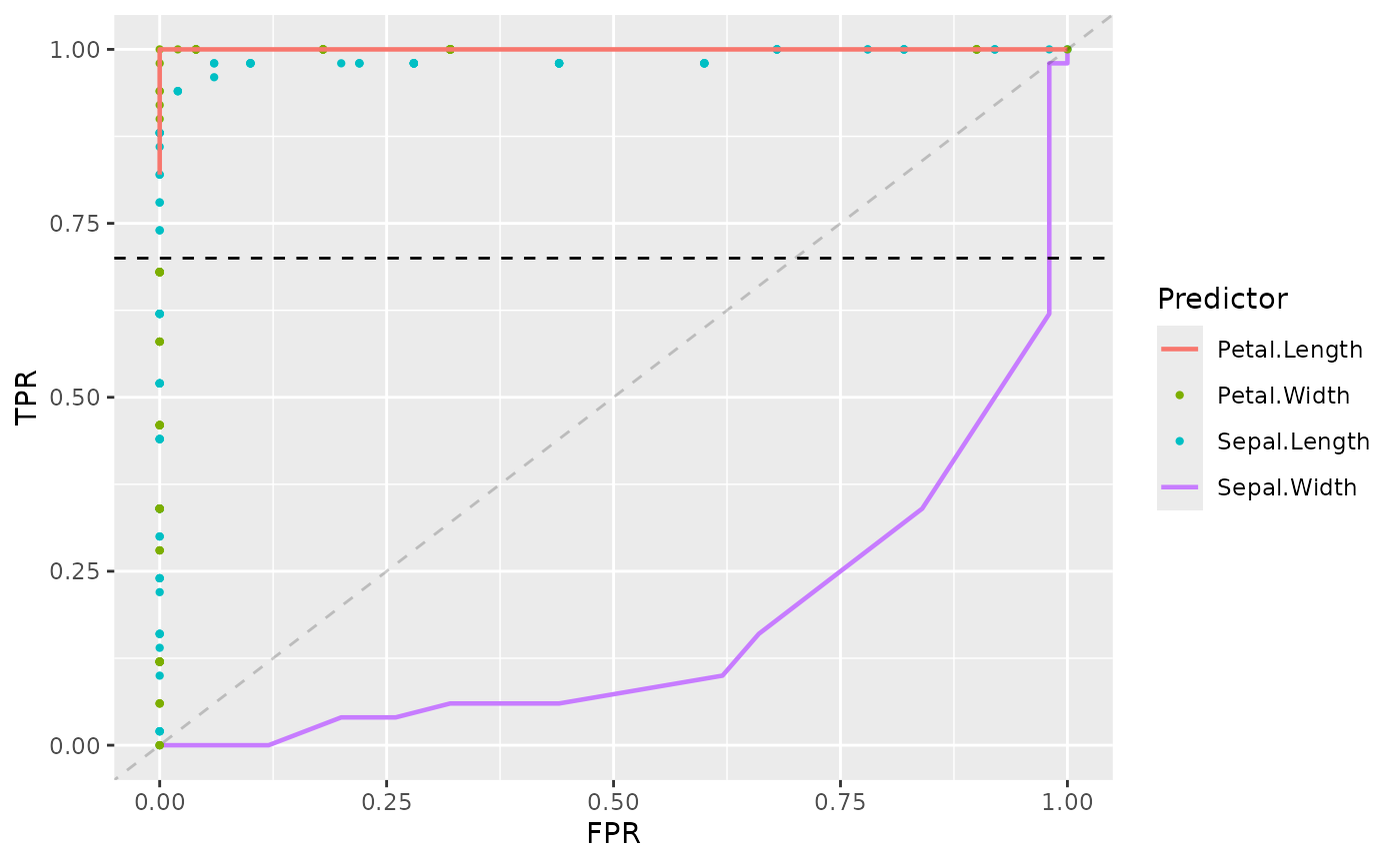
Now by using + operator we can add further options to
the plot. For example, including chance line, adding further
points of other classifiers, etc.
sepal_length_plot +
  add_roc_curve(
    data = iris_subset,
    predictor = Sepal.Width,
    response = Species
  ) +
  add_roc_points(
    data = iris_subset,
    predictor = Petal.Width,
    response = Species
  ) +
  add_partial_roc_curve(
    data = iris_subset,
    predictor = Petal.Length,
    response = Species,
    ratio = "tpr",
    threshold = 0.7
  ) +
  add_threshold_line(
    threshold = 0.7,
    ratio = "tpr"
  ) +
  add_chance_line()
#> Ignoring unknown labels:
#> • fill : "Bound"